A competition medal is a small object with a lasting job. It must represent achievement, feel good in the hand, and remain legible years later. Imagine a runner lifting a medal after a rainy finish: wet ribbon, cool metal, and a logo partly hidden by a thumb. Those details matter. A beautiful concept can still fail if its lettering is too fine or its edges feel sharp.
Participation figures help explain the scale of the audience. Running USA’s 2024 State of the Running Industry report recorded 18.1 million U.S. road-race participants in 2023. That is a large group of finishers, organizers, and supporters who may encounter event medals. The number does not prescribe a design, but it makes usability worth considering. Industrial designer Dieter Rams put one useful principle simply: “Good design is as little design as possible.” Applied here, restraint can give the event name and achievement room to stand out.
How to design medals for competitions and awards is a practical question, not just a styling exercise. The seven tips ahead examine purpose, audience, shape, material, engraving, ribbon, and production checks. A raised edge may catch the light; tiny text may disappear against a textured background. Ask for a physical sample before approving a full order. It takes time. And it can reveal flaws a screen cannot. Some choices will still involve trade-offs, especially when cost, durability, and visual detail pull in different directions.
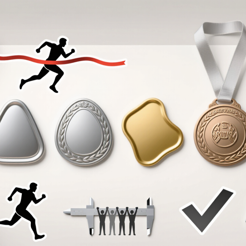
Before sketching a medal, decide what it recognizes and who will receive it. A youth race, a school debate, and a regional craft contest should not share the same visual language. Write one clear purpose statement, such as “reward persistence in a community trail race.” Keep it specific. That sentence can guide the shape, symbols, and wording, while preventing decorative choices from taking over.
Build the competition’s identity into details participants can recognize. A route profile, local leaf, or distinctive scoring mark may feel more meaningful than a generic trophy icon. Use the event name and year only if they remain readable at the medal’s actual size. Check lettering at roughly arm’s length, not just on a large screen. Small details matter.
Consider how the medal will be handled and displayed. A raised border can frame the design, while a recessed center may protect fine lines from everyday scratches. Match ribbon colors to the event’s visual identity, but confirm that text and symbols still stand out against them. A paper mock-up can reveal awkward proportions before production. It will not catch every issue; even a careful design may need another round of review. Ask organizers and likely recipients what feels unclear, then revise without losing the medal’s purpose.
A medal should feel right for the event before anyone reads its inscription. A circular shape suits traditional races, while a shield or angled edge can echo a team or tournament theme. Sketch the outline beside the event logo and check that both remain clear at actual size. Tiny details often disappear. A simple design usually reads better from across a room.
Tip: Match the medal’s size to how it will be presented. A 50–60 mm medal gives room for a date and event name without feeling oversized for most award ceremonies. Test a paper cutout first. Hold it in your hand and check its weight and balance. It is an imperfect test, but it can reveal an awkward shape early.
Material affects appearance, comfort, and production choices. Zinc alloy works well for detailed relief, while stainless steel offers a clean, modern look. For outdoor events, consider how the finish may handle handling and moisture; ask a qualified maker about suitable coatings. Compare samples under ordinary room lighting, not just polished product photos. A bright finish can look different beneath a gym’s cool lights. Keep the design practical: deep grooves may collect dirt, and very thin edges can feel less substantial.
Treat a medal face like a small sign that must work at arm’s length. Give the award name, year, and recipient a clear order. Use one dominant symbol, such as a torch or laurel, rather than several competing icons. Short wins. Nielsen Norman Group’s 2008 web-reading study found that people read about 28% of words on an average page. It studied screens, not medals, but the reminder is useful: viewers skim, so make key words easy to find.
Build contrast into the artwork before choosing finishes. WebAIM’s 2024 analysis found low-contrast text on 81% of the homepages it tested. That web accessibility finding is not medal-specific, yet it highlights a practical risk: pale lettering can disappear against polished metal. Pair dark enamel with bright raised text, or use a matte field behind fine details. Put essential wording on the front; reserve the reverse for a short event line or date. Then inspect a full-size proof under warm and cool light. I still sometimes favor elegant script too much; at small sizes, it can turn a winner’s name into decoration.
A medal feels more meaningful when it records the details people will want to remember. Add the event name, year, award category, or recipient’s name, but give each element enough space to remain readable. On a small medal, long wording can become crowded. A short inscription often works better. Check the lettering at actual size, not only on a large screen. Fine lines and tiny dates may disappear after production, especially around textured edges. Ask for a proof, and review spelling, spacing, and alignment before approving it. Small checks matter.
Finishes shape how those details look and feel. A polished gold-tone surface catches light, while an antique finish can bring out raised lettering and recessed patterns. Matte areas reduce glare and create contrast. Enamel adds color, but too many shades may compete with the award text. Try pairing one strong color with a restrained metal finish. A sample under ordinary indoor lighting can reveal issues that a digital mock-up misses. Ribbons count, too: their color should support the medal rather than overpower it. There is a trade-off here. More decoration may look impressive in a rendering, yet feel busy in hand. Decide which detail deserves attention, then let the rest breathe.
| Tip | Design Focus | What to Include | Practical Consideration |
|---|---|---|---|
| 1 | Make the award details specific | Include the event name, award category, achievement, and year where space allows. | Check all names, dates, and wording before production; short wording is easier to read on a small surface. |
| 2 | Establish a clear visual hierarchy | Give the event name or achievement the most emphasis, followed by supporting details such as the date or division. | Use differences in size, spacing, or placement to distinguish key information without overcrowding the design. |
| 3 | Choose readable lettering | Select simple, legible type for essential text and reserve decorative lettering for short headings or initials. | Small lettering and fine strokes can be difficult to reproduce clearly on a compact, textured, or raised surface. |
| 4 | Match the finish to the design | Consider gold-, silver-, or bronze-colored finishes, as well as antique-style or polished appearances. | Metallic colors describe an appearance and may differ from solid precious-metal content; confirm the actual material separately. |
| 5 | Use contrast to improve legibility | Pair raised or bright details with recessed or darker areas, or use contrasting enamel colors. | Strong contrast can help text and symbols stand out, while too many similar tones may make details harder to distinguish. |
| 6 | Plan the reverse side | Use the back for a recipient’s name, finishing place, event date, or a short commemorative message. | Personalized engraving requires space and time; confirm the available character count and layout before ordering. |
| 7 | Coordinate the ribbon and attachment | Choose ribbon colors that complement the medal and suit how recipients will wear or display it. | Check the ribbon width, attachment method, and medal orientation so the finished award hangs as intended. |
A medal can look polished on a screen and still disappoint in the hand. Review the material, thickness, and attachment points before approving the artwork. Raised edges should feel smooth, not sharp, and a ribbon loop must withstand repeated handling. A simple physical sample can reveal weak spots that a digital preview hides. Small details matter.
Readability needs its own test. View the design at actual medal size, not only enlarged on a monitor. Check whether the event name, year, and award category remain clear when engraved or cast. Fine lettering may fill in, especially on textured surfaces. Strong contrast and open spacing usually help. Ask someone unfamiliar with the design to read it; if they hesitate, revise it. I have seen decorative borders crowd out useful information, and it is easy to miss that while focusing on the centerpiece.
Production limits should shape the final layout. Confirm minimum line widths, available finishes, color options, and tooling constraints with the manufacturer before locking the design. Keep essential details away from deep relief or tight curves. Request a proof, then compare it with the approved file under ordinary indoor light. One overlooked issue is glare: shiny finishes can make small text harder to read. The review may feel repetitive, but a second check can prevent a costly batch of medals that looks different from the intended design.
Suggested starting targets in millimeters for legibility and production. These are not universal standards; confirm final dimensions with your medal manufacturer.
Readable lettering, sturdy fine details, sufficient relief, and a clear edge margin help a medal remain legible and practical to produce.
A circle suits traditional races. A shield or angled edge can echo a team theme. Sketch the outline beside the event logo. Tiny details vanish.
A 50–60 mm medal can fit the event name and date without feeling oversized. Try a paper cutout in your hand. It is imperfect, but useful.
Zinc alloy can show detailed relief, while stainless steel offers a clean, modern look. Compare physical samples under ordinary room lighting. Photos can be misleading.
Ask a qualified maker about coatings that suit moisture and frequent handling. Deep grooves may collect dirt, and thin edges can feel flimsy.
Review its thickness, edges, and ribbon loop before approving the artwork. Raised edges should feel smooth. A physical sample may reveal weak spots.
View the design at actual medal size. Check the event name, year, and award category. Fine letters can fill in, especially on textured surfaces.
Ask them to read the text without help. If they hesitate, revise the layout. Decorative borders can crowd out useful details.
Check minimum line widths, finishes, colors, and tooling limits with the maker. Request a proof and compare it with the approved file. Watch for glare.
How to design medals for competitions and awards begins with understanding what the medal represents. Define the event’s purpose, audience, and identity before choosing a shape, size, and material that suit the occasion and feel comfortable to wear. A thoughtful design should make the award recognizable while reflecting the spirit and importance of the achievement.
Arrange symbols, wording, and artwork so the key details are easy to see at a glance. Add relevant award information, such as the event name or achievement level, and use finishes to create visual contrast without overcrowding the design. Before production, review the medal for readability, durability, and practical requirements, including how its details will appear at the chosen size. Careful planning at each stage can result in a distinctive, lasting keepsake that celebrates participants and their accomplishments.

TOP Crafts