Top 10 Tips to Make Custom Badges More Attractive and Recognizable?

Time:2026-06-07 Author:Charlotte
0%

Creating custom badges is an art. They serve as symbols of achievement, identity, and creativity. A well-designed badge can communicate a message that resonates. However, many overlook the importance of making these symbols attractive and recognizable.

So, how to make custom badges more attractive and recognizable? This guide explores essential tips. You may think that it just requires colorful designs or catchy phrases. While these elements are crucial, the depth of your design matters too. Balance simplicity with uniqueness. Strive for clarity, but don’t shy away from personal flair. In this quest, reflection is vital. What makes your badge stand out? Is it the shape, color, or emblem?

Understanding your audience is key to crafting meaningful badges. Do they prefer modern designs or classic styles? Ask for feedback. Use their insights to refine your approach. The journey to create appealing badges is ongoing. Mistakes will happen. Embrace them as learning opportunities. Design with intention, and your badges will shine brightly in any context.

Top 10 Tips to Make Custom Badges More Attractive and Recognizable?

Choosing the Right Shape and Size for Your Custom Badges

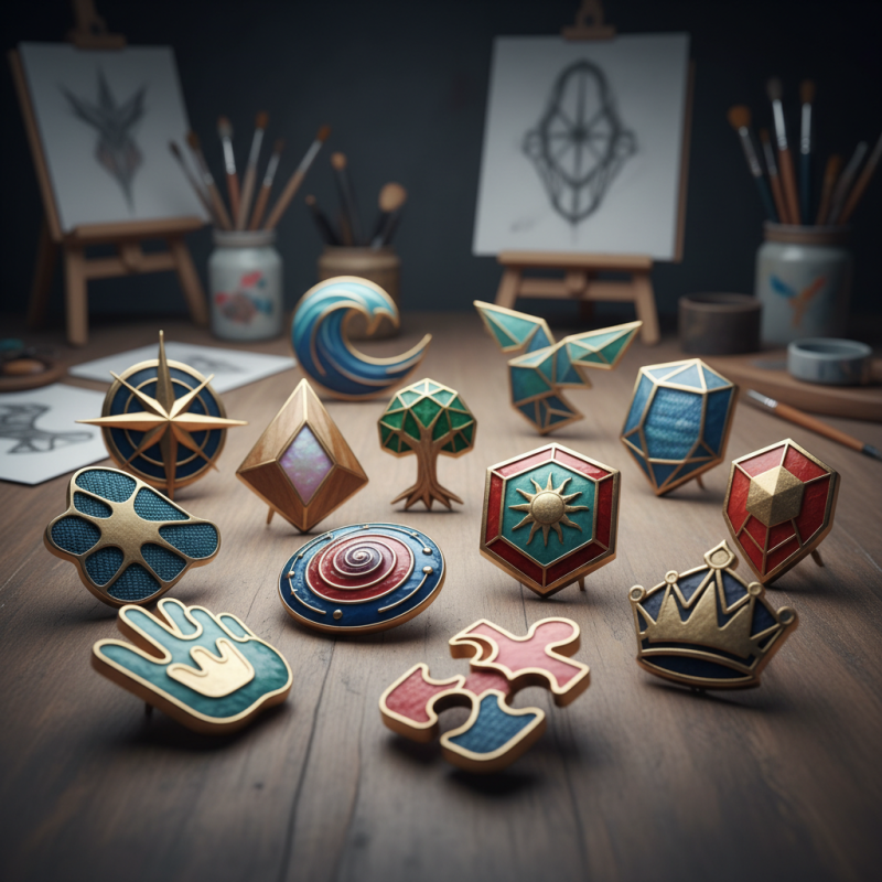
When designing custom badges, the shape and size play crucial roles in their visibility and appeal. Research shows that people are 75% more likely to notice unique shapes compared to standard round badges. This highlights the importance of creativity in your design. Shapes like stars or shields can evoke certain feelings. A star can symbolize excellence, while a shield signifies protection or accomplishment.

Moreover, size matters significantly. Badges that are too small may be overlooked. In contrast, oversized badges can appear overwhelming. Studies suggest a badge size of 2-3 inches wide is optimal. This size allows for clear visibility while remaining manageable for wearers. A well-sized badge balances recognition and comfort, making it easier for people to engage with.

However, achieving the perfect balance isn't always straightforward. Sometimes, designs risk becoming cluttered with too much information. It's essential to keep the message clear. Minimalist badges often perform better in attracting attention. Icons and simple text can convey the intended message without distractions. Badges should resonate with the audience, fostering a memorable experience.

Incorporating Eye-Catching Colors and Graphics

In the world of custom badges, color and graphics play a crucial role in attracting attention. Studies show that colors improve brand recognition by 80%. Bright and eye-catching colors can evoke emotions, while dull hues may lead to disinterest. For example, red creates urgency, while blue instills trust. Using vibrant shades can be a game changer when creating effective badges.

Incorporating graphics also enhances recognition. According to recent reports, visual content is processed 60,000 times faster than text. Simple yet bold designs resonate better with audiences. Icons or symbols that clearly represent the badge’s purpose can make a significant difference. A badge with a unique graphic stands out more than one with generic imagery.

However, not all designs hit the mark. Some badges remain unrecognizable despite colorful choices. Overcrowding with too many elements can confuse viewers. Striking a balance between simplicity and creativity is essential. Testing designs with target audiences helps identify what truly works. Design is not just about aesthetics; it’s about clear communication and immediate impact.

Utilizing Clear and Memorable Fonts for Text

When designing custom badges, the choice of font is crucial. Clear and memorable fonts enhance visibility and recognition. A simple font can communicate a message effectively. For instance, sans-serif fonts often appear clean and modern. However, some might argue that they lack personality. This is where creativity comes into play. Finding a balance between clarity and character is essential.

Experimenting with different typographies can yield surprising results. Bold fonts can capture attention quickly. On the other hand, ornate fonts might confuse viewers. It's important to consider the context in which the badge will be displayed. A badge worn at a formal event should look polished. Conversely, a badge for a casual gathering can be playful and fun.

Testing font choices with a sample audience can provide valuable insights. Feedback is an essential step; it helps identify which designs resonate best. Not all styles will suit every purpose. Learning from what doesn’t work is just as important as celebrating successes. By choosing the right font, badges can become more than just identification tools; they can tell a story.

Adding Unique Textures and Materials for Enhanced Appeal

When creating custom badges, using unique textures and materials can significantly enhance their visual appeal. Consider incorporating elements like wood, metal, or fabric to give your badges a tactile quality. Materials such as leather can add a touch of sophistication, while eco-friendly options attract a growing market segment. Experimenting with these textures can directly impact how the badge feels in hand and how it represents your brand or message.

Texture isn’t everything. Remember that the design should remain legible and clear. Some materials may obscure important details. Balancing visibility with creativity is essential. Not all textures will suit every purpose. Sometimes, a flashy design might draw attention but distract from the badge’s message. Strive for harmony between material and design to ensure the badge speaks to its audience.

Adding unique finishes can also elevate the overall look. Think about embossed patterns, matte vs. glossy surfaces, or even customizable features. These small details can set different designs apart. However, testing various combinations might lead to unexpected outcomes. Keep an open mind and be ready to refine your choices. Such experimentation can uncover new techniques that resonate more deeply with those who encounter your badges.

Top 10 Tips to Make Custom Badges More Attractive and Recognizable

Designing for Versatility and Recognizability Across Platforms

Creating custom badges that stand out is essential for effective branding. When designing for versatility across platforms, your badges must maintain their integrity at different sizes and resolutions. Consider using vector graphics. They scale nicely, preserving quality no matter how small or large they appear.

Choosing a limited color palette can enhance recognizability. Stick to two or three colors that align with your brand identity. Ensure the colors are visible against different backgrounds. Testing your designs in various contexts can highlight issues. An attractive badge may not always translate well if it loses clarity in an app or a webpage.

Adding unique shapes or icons can further distinguish your badges. Shapes can evoke certain feelings. A rounded badge may feel friendly, while a sharp-edged badge might convey professionalism. However, be cautious of overly complex designs; simplicity often triumphs. Regular feedback from users can provide insights into what works and what doesn’t. Reflecting on their suggestions can lead to improvements that make your badges more effective.

FAQS

: Why are colors important in badge design?

: Colors enhance brand recognition and evoke emotions. Bright colors attract attention while dull hues may lead to disinterest.

How can graphics improve badge recognition?

Graphics make badges visually appealing. They are processed faster than text, making simple designs memorable for audiences.

What happens if a badge design is overcrowded?

Overcrowding can confuse viewers, making the badge unrecognizable. Simplicity paired with creativity tends to work better.

Why is font selection critical for badges?

Fonts affect visibility and can communicate messages effectively. A simple font is often clearer, while bold styles can be eye-catching.

Can all font styles work for every badge purpose?

No, not all styles suit every purpose. Testing fonts with audiences provides insights into what resonates best.

How can texture enhance badge appeal?

Unique textures such as wood or metal add tactile quality, enhancing visual appeal and making badges memorable.

Should design compromise readability for creativity?

Design should never compromise readability. Balancing visibility with creative elements ensures the badge's message is clear.

Is experimenting with materials beneficial in badge design?

Yes, experimenting with materials can lead to surprising outcomes. It’s important to keep an open mind during the design process.

What role do finishes play in badge design?

Unique finishes, like embossed patterns or glossy surfaces, elevate the look. Small details can significantly impact overall appeal.

How can feedback improve badge design?

Feedback helps identify which designs resonate well. Learning from mistakes is essential for creating effective badge designs.

Conclusion

When considering how to make custom badges more attractive and recognizable, several key factors come into play. First, selecting the right shape and size is crucial, as it impacts visibility and appeal. Incorporating eye-catching colors and graphics can draw attention, while using clear and memorable fonts ensures that text is easily readable. Additionally, adding unique textures and materials can enhance the tactile experience, making badges stand out even further.

Designing badges for versatility across various platforms is equally important, ensuring they remain recognizable whether on digital interfaces or physical displays. By focusing on these aspects, anyone can create custom badges that not only catch the eye but also leave a lasting impression.

Charlotte

Charlotte

Charlotte is a seasoned marketing professional with a deep understanding of the company's portfolio and a passion for elevating its presence in the market. With a keen eye for detail and a commitment to excellence, she ensures that our professional blog is regularly updated with insightful articles......