Custom badges turn a small surface into a highly visible brand signal. Their appeal comes from three elements: clear shape, memorable color, and personal meaning. A well-designed enamel badge can catch light on a jacket, while a woven badge can show texture from several feet away. These physical details help people notice, remember, and discuss an organization.
The ASI Ad Impressions Study 2023 reported that 85% of promotional-product recipients remembered the advertiser. It also found that 83% enjoyed receiving promotional products. These figures support the value of useful, attractive merchandise, although they do not measure custom badges alone. That limitation matters. A badge is not automatically memorable because it is colorful. Cluttered lettering, weak contrast, or an overly detailed logo can reduce recognition.
So, How to make custom badges more attractive and recognizable? Brand identity expert Marty Neumeier offers a practical principle: “A brand is not what you say it is. It’s what they say it is.” His statement applies directly to badge design. The audience must understand the symbol quickly, even without an explanation. Consistent colors, bold outlines, and one dominant icon usually create stronger recognition than several competing graphics. The Promotional Products Association International also emphasizes product usefulness, quality, and relevance in consumer research. Those qualities should guide material selection, edge finishing, and placement.
There is no perfect formula. A badge may look excellent on a screen but feel ordinary in the hand. Testing sample sizes, pin positions, and viewing distances can reveal that gap. Small revisions often create the strongest result.
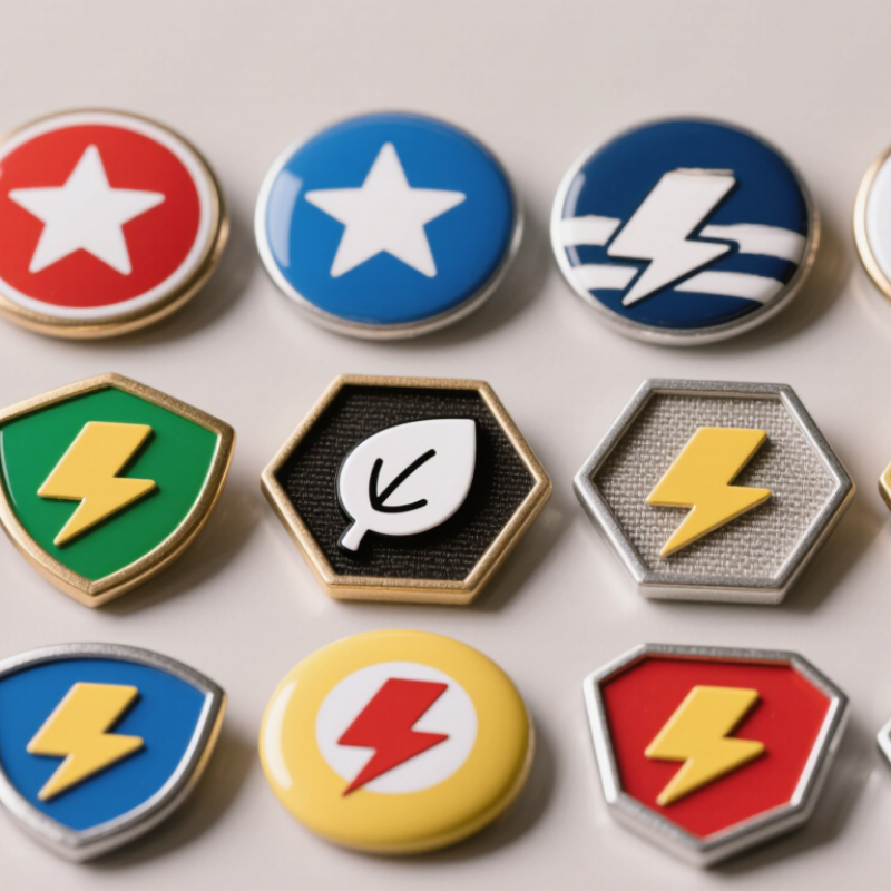
Custom badges are small identity markers made for a specific group, event, role, or personal message. They may use metal, fabric, enamel, acrylic, or recycled materials. A badge usually carries a symbol, short name, date, or color code. Its purpose is simple: help people recognize shared membership or responsibility quickly. In practical use, it works like a visual handshake. Not every design succeeds. Tiny lettering can disappear under dim lighting or from several steps away.
The process begins with a clear brief covering size, audience, attachment method, colors, and expected use. A designer converts the idea into a clean outline with limited details. The artwork then guides cutting, molding, printing, stitching, or surface finishing. Pins, clips, magnets, and secure backings help the badge stay on clothing, bags, or display boards. Material choice matters. A raised metal edge feels durable, while woven fabric feels lighter and more flexible. Tests should check sharp edges, color contrast, fastening strength, and comfort during repeated wear.
Recognition improves when the badge has one memorable shape or color. Consistent placement can help people identify roles without reading every word. In my experience, users notice comfort before craftsmanship, which is easy to overlook. A beautiful badge may still fail if it scratches fabric or twists while moving. Feedback from actual wearers often exposes these weaknesses. I would revise the design after a trial, even when the first sample looks impressive. Small changes can make the badge clearer, safer, and more natural to use.
| Design or Production Dimension | Typical Data or Reference | How Custom Badges Work | Why They Look More Attractive | Why They Are More Recognizable |
|---|---|---|---|---|
| Definition | A custom badge is a small visual identifier produced with a selected shape, color scheme, symbol, text, and backing method. | The artwork is converted into a physical badge through processes such as embroidery, woven construction, molded PVC, printed coating, or metal finishing. | The design can be adapted to a specific purpose instead of relying on a generic shape or symbol. | A consistent combination of visual cues helps people identify the badge quickly in repeated settings. |
| Shape and silhouette | Common formats include circular, rectangular, shield, oval, and custom-cut outlines. | The outer contour is manufactured or cut to match the approved artwork. | A distinctive silhouette creates visual variety and can make the badge appear more purposeful and refined. | People can recognize an unusual outline even when small text or fine details are difficult to see. |
| Color contrast | For readable text, WCAG 2.2 recommends a minimum contrast ratio of 4.5:1 for normal-sized text and 3:1 for large text. | Foreground and background colors are selected to separate lettering, symbols, and borders from one another. | Balanced contrast makes the design cleaner and prevents the badge from appearing visually crowded. | Strong contrast improves legibility and allows the main symbol or word to be detected more quickly. |
| Color palette | Recommended design reference: two to four main colors, with one dominant background or field color. | Colors are applied through thread, enamel, ink, molded material, or printed film, depending on the badge type. | A controlled palette creates harmony and makes the badge look intentional rather than random. | Repeated colors act as fast visual signals, especially when several badges are viewed together. |
| Typography | Short words, simple letterforms, adequate spacing, and high contrast are generally easier to read at small sizes. | Text is reproduced with stitches, woven threads, raised material, ink, or engraved and filled surfaces. | Clear typography gives the badge a polished appearance and reduces visual clutter. | Simple lettering remains more identifiable when the badge is viewed briefly or from a distance. |
| Icon and symbol | Simple symbols with strong outlines usually contain fewer recognition steps than highly detailed illustrations. | The symbol is converted into a production-ready shape with defined lines, fills, and boundaries. | Reduced detail produces a cleaner composition and helps the central idea stand out. | A recognizable symbol can communicate meaning even when the accompanying text cannot be read. |
| Material and finish | Common options include embroidered fabric, woven fabric, molded PVC, printed fabric, metal, and coated metal. | The selected material determines surface texture, edge definition, flexibility, weight, and resistance to everyday handling. | Texture, stitching, gloss, matte surfaces, and raised elements add depth and tactile interest. | Material-specific textures can become an additional recognition cue beyond color and shape. |
| Relief and texture | Raised borders, molded sections, embroidery, and engraved details create physical depth. | Depth is added through thread thickness, molded layers, embossing, engraving, or dimensional coatings. | Physical depth catches light and gives the badge a more premium, crafted appearance. | Distinctive texture can help users distinguish a badge by touch or by its visible surface pattern. |
| Size and viewing distance | Common badge dimensions are approximately 25–75 mm across, although the final size depends on use and artwork detail. | The design is scaled so the smallest important features remain manufacturable and readable. | Proportional sizing prevents the badge from looking either visually weak or unnecessarily bulky. | A suitable size preserves the visibility of the main outline, symbol, and short text during normal viewing. |
| Attachment method | Typical backings include sew-on, iron-on, hook-and-loop, adhesive, magnetic, and pin-based attachments. | The backing connects the badge to fabric, equipment, packaging, or another smooth surface. | A neat attachment keeps the badge aligned and protects the intended visual presentation. | Consistent placement makes the badge easier to locate and compare across uniforms, bags, displays, or products. |
| Repetition and consistency | Recognition generally improves when the same shape, colors, symbol, and placement are used repeatedly. | Each production run follows the same approved artwork and specification sheet. | Consistency creates a coherent visual system and makes individual badges appear more professionally designed. | Repeated exposure strengthens the association between the badge and the group, activity, role, or event it represents. |
| Production workflow | Typical stages: concept, artwork preparation, proof approval, material selection, production, quality inspection, and delivery. | Digital artwork is translated into machine instructions, molds, screens, embroidery files, or engraving paths. | Proofing allows spacing, color balance, edge quality, and proportions to be refined before production. | Quality control helps ensure that every badge presents the same recognition cues with minimal variation. |
| Overall recognition effect | Recognition is strongest when shape, contrast, symbol, text, material, and placement support one another. | Custom badges combine multiple visual and physical signals into one compact identifier. | Personalized proportions, finishes, and textures create a stronger emotional and visual impression than a generic identifier. | Multiple consistent cues allow the badge to be recognized through outline, color, symbol, text, or texture—even when one cue is partly obscured. |
Custom badges identify a group, event, role, or personal message. They act like a quick visual handshake. A badge may show a symbol, short name, date, or color code.
Common options include metal, fabric, enamel, acrylic, and recycled materials. Metal feels durable and structured. Fabric feels lighter and more flexible. Material choice should match the setting and expected wear.
The process starts with size, audience, colors, attachment method, and usage details. A designer turns the idea into a simple outline. That artwork guides cutting, molding, printing, stitching, or finishing.
One memorable shape, color, or symbol usually works best. Clear contrast helps people notice it quickly. Consistent placement also helps users identify roles without reading every word.
Repeated exposure makes the design easier to recall. Someone may remember a blue circular badge before remembering a person’s name. Simple visuals create a useful mental shortcut.
Tiny lettering may disappear in dim lighting. Too many symbols can weaken recognition. Weak contrast can make important details unreadable. An unclear abbreviation may leave the badge unused in a drawer.
Test the badge at arm’s length and under realistic lighting. Check color contrast, sharp edges, attachment strength, and reading speed. Ask several wearers what they remember later. Their answers may challenge the designer’s favorite detail.
Choose pins, clips, magnets, or secure backings for the intended clothing or bag. Check whether the badge scratches fabric or twists during movement. Comfort often matters before fine craftsmanship. Test it outdoors.
Custom badges are small, purposefully designed symbols that communicate identity, membership, achievement, or a specific message at a glance. They can be made from materials such as metal, fabric, plastic, or eco-friendly alternatives, with details added through colors, shapes, text, textures, and finishes. Their visual appeal depends on a balanced layout, readable lettering, memorable imagery, suitable color contrast, and a distinctive outline that remains recognizable even at a small size. These elements help people quickly connect the badge with its meaning and remember it over time.
How to make custom badges more attractive and recognizable depends on matching the design to its audience and intended use. Custom badges are commonly used for events, schools, teams, workplaces, clubs, community activities, and personal projects. Their effectiveness is influenced by durability, production quality, comfort, visibility, consistency, and how clearly they express the intended message. A simple, meaningful design is often more effective than one crowded with unnecessary details.

 TOP Crafts